Accendo Reliability

Your Reliability Engineering Professional Development Site

  • Home
  • About
    • Contributors
    • About Us
    • Colophon
    • Survey
  • Reliability.fm
  • Articles
    • CRE Preparation Notes
    • NoMTBF
    • on Leadership & Career
      • Advanced Engineering Culture
      • ASQR&R
      • Engineering Leadership
      • Managing in the 2000s
      • Product Development and Process Improvement
    • on Maintenance Reliability
      • Aasan Asset Management
      • AI & Predictive Maintenance
      • Asset Management in the Mining Industry
      • CMMS and Maintenance Management
      • CMMS and Reliability
      • Conscious Asset
      • EAM & CMMS
      • Everyday RCM
      • History of Maintenance Management
      • Life Cycle Asset Management
      • Maintenance and Reliability
      • Maintenance Management
      • Plant Maintenance
      • Process Plant Reliability Engineering
      • RCM Blitz®
      • ReliabilityXperience
      • Rob’s Reliability Project
      • The Intelligent Transformer Blog
      • The People Side of Maintenance
      • The Reliability Mindset
    • on Product Reliability
      • Accelerated Reliability
      • Achieving the Benefits of Reliability
      • Apex Ridge
      • Field Reliability Data Analysis
      • Metals Engineering and Product Reliability
      • Musings on Reliability and Maintenance Topics
      • Product Validation
      • Reliability by Design
      • Reliability Competence
      • Reliability Engineering Insights
      • Reliability in Emerging Technology
      • Reliability Knowledge
    • on Risk & Safety
      • CERM® Risk Insights
      • Equipment Risk and Reliability in Downhole Applications
      • Operational Risk Process Safety
    • on Systems Thinking
      • Communicating with FINESSE
      • The RCA
    • on Tools & Techniques
      • Big Data & Analytics
      • Experimental Design for NPD
      • Innovative Thinking in Reliability and Durability
      • Inside and Beyond HALT
      • Inside FMEA
      • Institute of Quality & Reliability
      • Integral Concepts
      • Learning from Failures
      • Progress in Field Reliability?
      • R for Engineering
      • Reliability Engineering Using Python
      • Reliability Reflections
      • Statistical Methods for Failure-Time Data
      • Testing 1 2 3
      • The Manufacturing Academy
  • eBooks
  • Resources
    • Accendo Authors
    • FMEA Resources
    • Glossary
    • Feed Forward Publications
    • Openings
    • Books
    • Webinar Sources
    • Podcasts
  • Courses
    • Your Courses
    • Live Courses
      • Introduction to Reliability Engineering & Accelerated Testings Course Landing Page
      • Advanced Accelerated Testing Course Landing Page
    • Integral Concepts Courses
      • Reliability Analysis Methods Course Landing Page
      • Applied Reliability Analysis Course Landing Page
      • Statistics, Hypothesis Testing, & Regression Modeling Course Landing Page
      • Measurement System Assessment Course Landing Page
      • SPC & Process Capability Course Landing Page
      • Design of Experiments Course Landing Page
    • The Manufacturing Academy Courses
      • An Introduction to Reliability Engineering
      • Reliability Engineering Statistics
      • An Introduction to Quality Engineering
      • Quality Engineering Statistics
      • FMEA in Practice
      • Process Capability Analysis course
      • Root Cause Analysis and the 8D Corrective Action Process course
      • Return on Investment online course
    • Industrial Metallurgist Courses
    • FMEA courses Powered by The Luminous Group
    • Foundations of RCM online course
    • Reliability Engineering for Heavy Industry
    • How to be an Online Student
    • Quondam Courses
  • Calendar
    • Call for Papers Listing
    • Upcoming Webinars
    • Webinar Calendar
  • Login
    • Member Home
  • Barringer Process Reliability Introduction Course Landing Page
  • Upcoming Live Events
You are here: Home / Articles / The Mighty Youden Plot

by Gabor Szabo Leave a Comment

The Mighty Youden Plot

The Mighty Youden Plot

a graphical technique that every engineer needs in their toolbox

If there is one graphical technique that deserves a lot more attention that it gets and that every engineer needs to utilize in their day to day, my vote would definitely go for the mighty Youden Plot.

An example of a Youden plot showing measurement 1 plotted against measurement 2 with 45° line
A Youden Plot

Have you heard of it ? What is it? You may have come across a post I wrote on it a while ago. If you didn’t, here’s the cliff notes version:

  • Originally developed by William J. Youden back in 1959 for inter-laboratory comparisons (hence the name Youden Plot)
  • An excellent technique for diagnosis and experimentation
  • A special kind of scatterplot where paired measurements are plotted
  • The two axes span the same range, and there is a 45-degree line called the line of perfect agreement (not a regression line!)
  • Departures perpendicular to the 45-line denote variation within the pairs of measurements
  • Range of values on either axis signifies variation between the units
Same Youden plot with annotations along x and y axes titled between, and another spanning the 45° line labeled within

OK, great, but what can they be used for?

They can be used for any kind of diagnostic or experimental study where a paired comparison of the same experimental units is conducted. The goal of the comparison can be to compare

  • Different states of the same units
  • The same units measured under different conditions or at different locations
  • An actual state to an ideal state

A few specific uses include but are not limited to:

  • Measurement systems analysis: repeatability error (repeats 1 and 2)
  • Method comparison studies: comparing two measurement systems
  • Bias studies: comparing actual to truth/known standard
  • Diagnosis: separating inputs from the function (see Diagnosing Performance and Reliability by David Hartshorne)
  • Taguchi robust engineering studies: comparing the actual function to the ideal function

The good news is that I built a function for it specifically for engineers. The draw_youden_plot() function of the sherlock package makes plotting Youden Plots really easy. Let’s walk through a couple examples! You can access the code here.

In the first example, we are going to look at data from two repeated measurements of randomly selected parts, which will give us the ability to asses the repeatability of the measurement system.

Let’s run a few lines of code:

# EDITION 009: YOUDEN PLOT

# 0. LOAD PACKAGES ----

library(tidyverse)
library(sherlock)


# 1. DRAW_YOUDEN_PLOT() FUNCTION ----

# 1.1 REPEATABILITY ASSESSMENT ----

youden_plot_data %>% 
    draw_youden_plot(x_axis_var = measurement_1, y_axis_var = measurement_2, size = 3)
the result of the above code showing a basic Youden plot

Above is the Youden Plot we’ve created. The shape of the point cloud tells us that the repeatability of the system is pretty decent; you can ballpark this by comparing the width of the interval perpendicular to the 45-degree line with the variation in the parts (the range of measurements on either axis).

We can also group by specific variable, for example operator. In this case, let’s group by a variable called location, which refers to measurement location within the unit.

youden_plot_data %>% 
    draw_youden_plot(x_axis_var = measurement_1, y_axis_var = measurement_2, grouping_var = location)
a plot with four sets of measurements at four different locations, color-coded on one plot and each set in an individual plot
Grouped by location variable

Another example of the application of Youden Plots is of a method comparison study. In the below example, two gages are compared, and the comparison is done by measuring the same set of units once by each gage (gage 1 and 2, respectively).

# 1.2 METHOD COMPARISON ----
youden_plot_data_2 %>% 
    draw_youden_plot(x_axis_var = gage_1, 
                     y_axis_var = gage_2, 
                     size = 3)
A plot with the points offset from the 45° line  indicating an disagreement

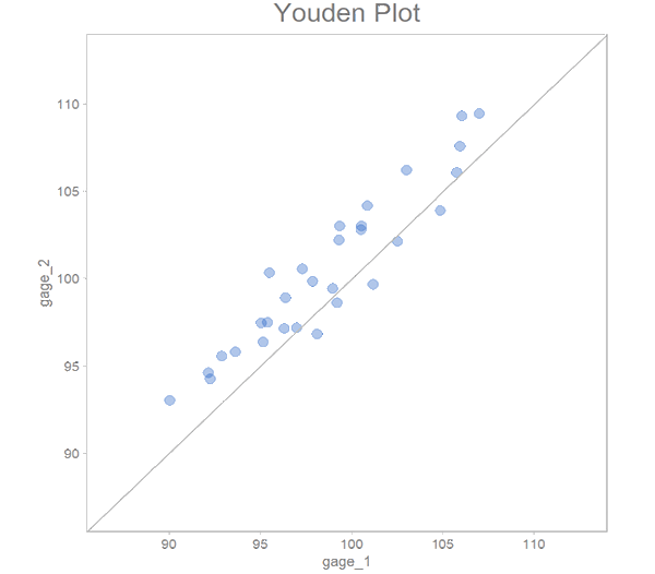
There’s clearly disagreement here in that measurements from gage 2 tend to come in higher than those from gage 1. This clearly indicates systemic error, that is bias.

There is a neat built-in feature that allows you to draw a median line to visualize the amount of bias and to see whether the bias is consistent over the range. All you do is set median_line to TRUE. Here we go:

# 1.2.1 MEDIAN LINE PLOTTED ----
youden_plot_data_2 %>% 
    draw_youden_plot(x_axis_var = gage_1, 
                     y_axis_var = gage_2, 
                     median_line = TRUE, 
                     size = 3, 
                     analysis_desc_label = "Method Comparison - gage 1 and 2")
same offset data Youden plot with fitted line to indicated amount of disagreement between the two gages
Median line plotted

That’s it for now, but I will be talking more about Youden Plots in future editions. I hope you enjoyed this week’s edition!

Resources for this week’s edition:

  • sherlock package
  • Post on Youden plots

Resources for learning R:

  • R for Data Science: a very thorough reference book by Hadley Wickham, the creator of the tidyverse. Absolutely free of charge and full of relevant examples and practice tests.
  • ggplot2 reference book: a super detailed online book on the gpplot2 plotting package.
  • My favorite R course, Business Science DS4B101-R: I learned R mainly throgh this course. Highly recommended if you want to get up to speed and beyond in a relatively short time. It has everything one will need from data cleaning to data visualization to modeling. This course is especially useful for engineers trying to learn or get good at R as it heavily focuses on the fundamentals but goes way beyond just that. Note: this is an affiliate link, meaning you get a hefty discount if you purchase a course, and I receive a small commission.

Filed Under: Articles, on Tools & Techniques, R for Engineering

About Gabor Szabo

Gabor is a quality engineering and data professional and has over 15 years of experience in quality having worked in the medical device, automotive and other manufacturing industries. He holds a BS in Engineering Management.

Gabor's specialties and interests include problem solving, statistical engineering and analysis through the use of data, and developing others.

« What gets Monitored, gets Measured, gets Improved
Make Business Communication “To” Senior Management for Better Results »

Leave a Reply Cancel reply

Your email address will not be published. Required fields are marked *

R for Engineering logo Photo of Gabor SzaboArticles by Gabor Szabo
in the R for Engineering article series

Join Accendo

Receive information and updates about articles and many other resources offered by Accendo Reliability by becoming a member.

It’s free and only takes a minute.

Join Today

Recent Posts

  • Gremlins today
  • The Power of Vision in Leadership and Organizational Success
  • 3 Types of MTBF Stories
  • ALT: An in Depth Description
  • Project Email Economics

© 2025 FMS Reliability · Privacy Policy · Terms of Service · Cookies Policy