Accendo Reliability

Your Reliability Engineering Professional Development Site

  • Home
  • About
    • Contributors
    • About Us
    • Colophon
    • Survey
  • Reliability.fm
  • Articles
    • CRE Preparation Notes
    • NoMTBF
    • on Leadership & Career
      • Advanced Engineering Culture
      • ASQR&R
      • Engineering Leadership
      • Managing in the 2000s
      • Product Development and Process Improvement
    • on Maintenance Reliability
      • Aasan Asset Management
      • AI & Predictive Maintenance
      • Asset Management in the Mining Industry
      • CMMS and Maintenance Management
      • CMMS and Reliability
      • Conscious Asset
      • EAM & CMMS
      • Everyday RCM
      • History of Maintenance Management
      • Life Cycle Asset Management
      • Maintenance and Reliability
      • Maintenance Management
      • Plant Maintenance
      • Process Plant Reliability Engineering
      • RCM Blitz®
      • ReliabilityXperience
      • Rob’s Reliability Project
      • The Intelligent Transformer Blog
      • The People Side of Maintenance
      • The Reliability Mindset
    • on Product Reliability
      • Accelerated Reliability
      • Achieving the Benefits of Reliability
      • Apex Ridge
      • Field Reliability Data Analysis
      • Metals Engineering and Product Reliability
      • Musings on Reliability and Maintenance Topics
      • Product Validation
      • Reliability by Design
      • Reliability Competence
      • Reliability Engineering Insights
      • Reliability in Emerging Technology
      • Reliability Knowledge
    • on Risk & Safety
      • CERM® Risk Insights
      • Equipment Risk and Reliability in Downhole Applications
      • Operational Risk Process Safety
    • on Systems Thinking
      • Communicating with FINESSE
      • The RCA
    • on Tools & Techniques
      • Big Data & Analytics
      • Experimental Design for NPD
      • Innovative Thinking in Reliability and Durability
      • Inside and Beyond HALT
      • Inside FMEA
      • Institute of Quality & Reliability
      • Integral Concepts
      • Learning from Failures
      • Progress in Field Reliability?
      • R for Engineering
      • Reliability Engineering Using Python
      • Reliability Reflections
      • Statistical Methods for Failure-Time Data
      • Testing 1 2 3
      • The Manufacturing Academy
  • eBooks
  • Resources
    • Accendo Authors
    • FMEA Resources
    • Glossary
    • Feed Forward Publications
    • Openings
    • Books
    • Webinar Sources
    • Podcasts
  • Courses
    • Your Courses
    • Live Courses
      • Introduction to Reliability Engineering & Accelerated Testings Course Landing Page
      • Advanced Accelerated Testing Course Landing Page
    • Integral Concepts Courses
      • Reliability Analysis Methods Course Landing Page
      • Applied Reliability Analysis Course Landing Page
      • Statistics, Hypothesis Testing, & Regression Modeling Course Landing Page
      • Measurement System Assessment Course Landing Page
      • SPC & Process Capability Course Landing Page
      • Design of Experiments Course Landing Page
    • The Manufacturing Academy Courses
      • An Introduction to Reliability Engineering
      • Reliability Engineering Statistics
      • An Introduction to Quality Engineering
      • Quality Engineering Statistics
      • FMEA in Practice
      • Process Capability Analysis course
      • Root Cause Analysis and the 8D Corrective Action Process course
      • Return on Investment online course
    • Industrial Metallurgist Courses
    • FMEA courses Powered by The Luminous Group
    • Foundations of RCM online course
    • Reliability Engineering for Heavy Industry
    • How to be an Online Student
    • Quondam Courses
  • Calendar
    • Call for Papers Listing
    • Upcoming Webinars
    • Webinar Calendar
  • Login
    • Member Home
  • Barringer Process Reliability Introduction Course Landing Page
  • Upcoming Live Events
You are here: Home / Articles / Small Multiples, Huge Advantage

by Gabor Szabo Leave a Comment

Small Multiples, Huge Advantage

Small Multiples, Huge Advantage

In this week’s edition, I introduce you to the concept of small multiples, and, more importantly, how to make them in R. This is one of those really low effort-super high return kind of features of R that can make you look like a rock star of data visualization. So, without further ado, let’s jump right into it!

You can download the script here if you want to follow along.

We’ll continue working with the dataset we called bond_strength_long from last week after we had transformed it into a tidy format.

As you remember, in last week’s edition we used a technique called stratification to plot the data, and we saw that stratifying the data by a specific variable, in our case by manufacturing line, can reveal additional insight. Stratification is one of those super simple graphical techniques that can reveal differences and provide basis for further analysis. However, in order to truly start to characterize the performance of physical systems such as manufacturing equipment, we often need to take it one step further and go beyond simply stratifying by one variable.

A categorical scatterplot comparing five variables
Stratification

Cyclical behavior, that is observing consecutive machine cycles, can reveal a lot more information and clues than just stratifying by one variable. There’s a lot more to how to put this into perspective, but I will save that explanation for a later edition. For now, let’s just focus on plotting the data in terms of machine cycles.

The bond strength characterization study involved collecting pieces from three consecutive machine cycles from each of the five lines at three different times. The good thing is that machine cycle information has already been captured as a variable named Cycle (we created it just beofe converting the dataset into a long format). At this point, we just need to find a way to visualize it then. Since cyclical data has a time element to it, what we want to do is plot the three consecutive cycles in a line plot, so we’ll be using the geom_line() function instead of geom_point(). So, let’s see what happens when we run the below code.

# 3. PLOTTING ----

# 3.1 LINE PLOT - FIRST ATTEMPT ----
bond_strength_long %>% 
    ggplot(aes(Cycle, Bond_Strength)) +
    geom_line() +
    theme_sherlock()
a line plot showing bond strength reduction in variation from one cycle through 3 cycles
This doesn’t make too much sense

Well, this doesn’t quite look like what we were expecting to see, and that is because we’ll need to do grouping so that the line is created between cycles 1, 2 and 3 and not within each cycle. This is where using geom_line() can get a little more complicated than using geom_point(), but it’s definitely worth learning as it will pay dividends for you.

OK, let’s give this another shot. This time we’ve added the group argument within aes() and assigned Line to it. What this essentially means is that we are telling ggplot to group the output of every geom by the Line variable. Sound simple, right? Let’s see what the output looks like.

# 3.2 LINE PLOT - SECOND ATTEMPT ----
bond_strength_long %>% 
    ggplot(aes(Cycle, Bond_Strength, group = Line)) +
    geom_line() +
    theme_sherlock()
another attempt to plot bond strength with lines representing elements of the data changes over three cycles (no an informative)
This is not meaningful either

Well, it looks different now, but it still looks much like a piece of art rather than a visual display full of information. That is because even though this time we grouped by the Line variable, there is another variable, Time, that we didn’t account for, so what ggplot ended up doing was grouping by Line and connnecting all observations within each Line, including observations from the three time periods, together into a line plot.

We need to find a way to visually group by two variables. Well, this is where a technique called faceting comes into play!

The Concept of Small Multiples

Since faceting is really codename for small multiples, let’s take a minute to discuss what small multiples are. The term was coined by data visualization pioneer and educator Edward Tufte. In simple terms, small multiples are a data visualization technique where, instead of plotting all observations from a dataset in the same space, observations are grouped and displayed in separate smaller displays using the same axes and scale.

Let’s see how to do just what I explained above. We’ve added the function called facet_wrap() and specificied with the ~ operator (tilde) what variable to facet by. We’ve also added a color argument so observations from each manufacturing line is plotted in a unique color.

# 3.3 LINE PLOT WITH FACET_WRAP() ----
bond_strength_long %>% 
    ggplot(aes(Cycle, Bond_Strength, group = Line, color = Line)) +
    geom_line() +
    facet_wrap(~ Time) +
    theme_sherlock()
another attempt showing colored line plots of the five lines in separate plots for each time set (facetted by time)

You just created your first small multiples plot using faceting. Very simple yet so very powerful!

Instead of faceting by Time, we could also facet by Line: 

bond_strength_long %>% 
    ggplot(aes(Cycle, Bond_Strength, group = Time, color = Time)) +
    geom_line() +
    facet_wrap(~ Line, nrow = 1) +
    theme_sherlock()
another attempt showing colored line plots of the three time sets in separate plots for each line (facetted by line)

We can also facet by not one but two variables creating a grid-like display. This happens to come in handy in our case since we have two both Line and Time we want to facet by. For faceting by two variables, we need to use the facet_grid()function.

# 3.4 FACET_GRID() ----
bond_strength_long %>% 
    ggplot(aes(Cycle, Bond_Strength, group = Time, color = Time)) +
    geom_line() +
    facet_grid(Time ~ Line) +
    theme_sherlock() +
    labs(title = "Process Characterization Results",
         subtitle = "Bond Strength, Cycle by Line by Time")
a set of line plot facetted by both time and line

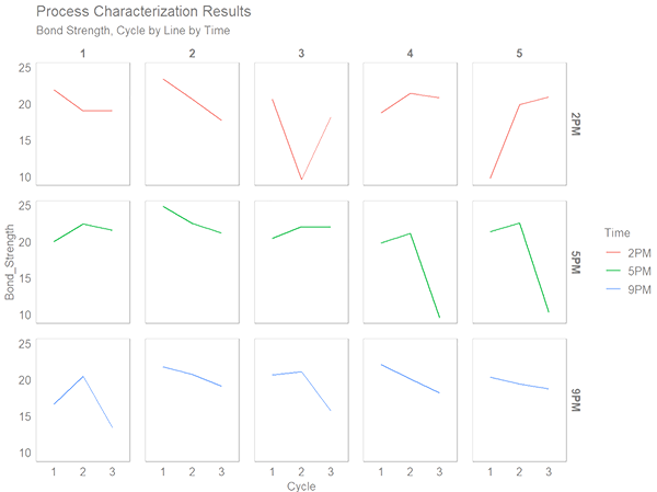
Take a look at the above small multiples plot you just created. Doesn’t it look super clean and easy to read? I think so.

Use this visualization technique and you will likely stand out from your peers.

To recap, this week we learned how to create a small multiples plot using facet_wrap() and facet_grid().

Filed Under: Articles, on Tools & Techniques, R for Engineering

About Gabor Szabo

Gabor is a quality engineering and data professional and has over 15 years of experience in quality having worked in the medical device, automotive and other manufacturing industries. He holds a BS in Engineering Management.

Gabor's specialties and interests include problem solving, statistical engineering and analysis through the use of data, and developing others.

« Nuclear Fusion Advances
Qualitative Assessments: Do the Fine Points of Risk Matrices Really Matter? »

Leave a Reply Cancel reply

Your email address will not be published. Required fields are marked *

R for Engineering logo Photo of Gabor SzaboArticles by Gabor Szabo
in the R for Engineering article series

Join Accendo

Receive information and updates about articles and many other resources offered by Accendo Reliability by becoming a member.

It’s free and only takes a minute.

Join Today

Recent Posts

  • Gremlins today
  • The Power of Vision in Leadership and Organizational Success
  • 3 Types of MTBF Stories
  • ALT: An in Depth Description
  • Project Email Economics

© 2025 FMS Reliability · Privacy Policy · Terms of Service · Cookies Policy