Accendo Reliability

Your Reliability Engineering Professional Development Site

  • Home
  • About
    • Contributors
    • About Us
    • Colophon
    • Survey
  • Reliability.fm
  • Articles
    • CRE Preparation Notes
    • NoMTBF
    • on Leadership & Career
      • Advanced Engineering Culture
      • ASQR&R
      • Engineering Leadership
      • Managing in the 2000s
      • Product Development and Process Improvement
    • on Maintenance Reliability
      • Aasan Asset Management
      • AI & Predictive Maintenance
      • Asset Management in the Mining Industry
      • CMMS and Maintenance Management
      • CMMS and Reliability
      • Conscious Asset
      • EAM & CMMS
      • Everyday RCM
      • History of Maintenance Management
      • Life Cycle Asset Management
      • Maintenance and Reliability
      • Maintenance Management
      • Plant Maintenance
      • Process Plant Reliability Engineering
      • RCM Blitz®
      • ReliabilityXperience
      • Rob’s Reliability Project
      • The Intelligent Transformer Blog
      • The People Side of Maintenance
      • The Reliability Mindset
    • on Product Reliability
      • Accelerated Reliability
      • Achieving the Benefits of Reliability
      • Apex Ridge
      • Field Reliability Data Analysis
      • Metals Engineering and Product Reliability
      • Musings on Reliability and Maintenance Topics
      • Product Validation
      • Reliability by Design
      • Reliability Competence
      • Reliability Engineering Insights
      • Reliability in Emerging Technology
      • Reliability Knowledge
    • on Risk & Safety
      • CERM® Risk Insights
      • Equipment Risk and Reliability in Downhole Applications
      • Operational Risk Process Safety
    • on Systems Thinking
      • Communicating with FINESSE
      • The RCA
    • on Tools & Techniques
      • Big Data & Analytics
      • Experimental Design for NPD
      • Innovative Thinking in Reliability and Durability
      • Inside and Beyond HALT
      • Inside FMEA
      • Institute of Quality & Reliability
      • Integral Concepts
      • Learning from Failures
      • Progress in Field Reliability?
      • R for Engineering
      • Reliability Engineering Using Python
      • Reliability Reflections
      • Statistical Methods for Failure-Time Data
      • Testing 1 2 3
      • The Manufacturing Academy
  • eBooks
  • Resources
    • Accendo Authors
    • FMEA Resources
    • Glossary
    • Feed Forward Publications
    • Openings
    • Books
    • Webinar Sources
    • Podcasts
  • Courses
    • Your Courses
    • Live Courses
      • Introduction to Reliability Engineering & Accelerated Testings Course Landing Page
      • Advanced Accelerated Testing Course Landing Page
    • Integral Concepts Courses
      • Reliability Analysis Methods Course Landing Page
      • Applied Reliability Analysis Course Landing Page
      • Statistics, Hypothesis Testing, & Regression Modeling Course Landing Page
      • Measurement System Assessment Course Landing Page
      • SPC & Process Capability Course Landing Page
      • Design of Experiments Course Landing Page
    • The Manufacturing Academy Courses
      • An Introduction to Reliability Engineering
      • Reliability Engineering Statistics
      • An Introduction to Quality Engineering
      • Quality Engineering Statistics
      • FMEA in Practice
      • Process Capability Analysis course
      • Root Cause Analysis and the 8D Corrective Action Process course
      • Return on Investment online course
    • Industrial Metallurgist Courses
    • FMEA courses Powered by The Luminous Group
    • Foundations of RCM online course
    • Reliability Engineering for Heavy Industry
    • How to be an Online Student
    • Quondam Courses
  • Calendar
    • Call for Papers Listing
    • Upcoming Webinars
    • Webinar Calendar
  • Login
    • Member Home
  • Barringer Process Reliability Introduction Course Landing Page
  • Upcoming Live Events
You are here: Home / Articles / The Informative Run Chart

by Fred Schenkelberg Leave a Comment

The Informative Run Chart

The Informative Run Chart

One of the very first plots to do with a string of data is a simple run plot. This plot provides information related to location, trends, patterns, and anomalies, The plot of the data over time is a rather informative chart.

You have most likely constructed many run charts; if not you really should. This short introduction to the run chart will cover creating and interpreting them. Plus we’ll mention a few cautions and tips, as well.

When to Build a Run Chart

A run chart works with a single data variable associated with a time sequence or meaningful order. For example, measuring cut length of nails as they come out of the cutting machine in sequence. Another example would be the monthly water consumption for a household.

On the other hand, if making the same measurement of a random collection of nails. Let’s say they are in a bin and are not organized by the sequence of manufacture, we have a single variable without the time sequence information.

Therefore, when collecting and organizing the data with a time sequence, use a run chart to view the data.

How to Create a Run Chart

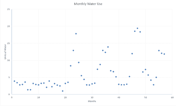
After collecting the data, check that the data is in time order. I’m going to plot the monthly water use (I record the water meter reading on the first of each month – I know that month lengths vary a bit, yet I can remember to check on the first of each month). Then calculate the monthly use by taking the difference in sequential months’ readings.

In my data set, the first three readings are 511.11, 514.99, and 518.41. Therefore starting the second month, we can determine the previous month’s use, 514.99 – 511.11 = 3. The next month’s use is 518.41 – 514.99 = 3.42. We have almost five years of data.

Since my data is in Excel, highlight the data column and select View | Insert | Scatter Plot (I’m using just the simple plot using dots – you could also connect the dots, if desired.

a simple run chart example showing periodic spikes

In R, assign the data to a variable, x <- c(3.88, 3.42, … ). Then plot that variable, plot(x). You could also plot the data directly plot(c(3.88, 3.42, … )) if you’d like.

Remember to add a title, axis labels, etc.

Interpreting the Chart Well

On first look, does the chart make sense? Any clerical errors or mistakes in the dataset? Second, what do you and others know about the process being measured? Do the patterns revealed in the plot make sense with what is known about the process? We installed a large vegetable garden and landscaping all around the house – and we did a lot more outdoor watering during the late summer each year.

In the monthly water use run chart, the first 20 months seem consistent between 1 and 4 units of water. Then there seem to be annual spikes in water use each year thereafter.

You likely noticed the change in use and the magnitude of the changes. Also, the increases in water use spike were on an annual cycle. Plus the overall water use is increasing.

Sometimes, the run chart will reveal patterns you did not notice before. Thus, this simple chart will help you learn more about the measured process.

Cautions and Tips

Be aware of the time order or sequencing of the data. If interested in nail cut length and using a box of 100 nails from the hardware store, we may learn about the mean and variance, yet we will not have meaningful information about changes or patterns due to time-related changes in the cutting machine.

Instead, if we record the nail cut length in the sequence of being taken from the box, we may find a time sequence pattern related to our measurement system. Given the nails in the box are in random order and not in the sequence of manufacture.

While creating a run chart is easy, it is informative as related to a time sequence. Therefore, be cautious during data collection and recording to preserve the time sequence information.

A run chart is not a control chart, yet it provides some information related to stability, trends, etc. To determine process stability, consider a run chart may as a quick look, yet a control chart is an appropriate tool to assess stability.

Finally, remember that a run chart may appear to show a trend or pattern, yet it may be due to random fluctuation. Always compare what you see in the plot with what you know (or can verify) about the process under study.

Run charts are one of the 7 Basic Quality Tools (on some lists) and should be a routine tool when examining a time-sequenced variable.

Filed Under: Articles, CRE Preparation Notes, Probability and Statistics for Reliability

About Fred Schenkelberg

I am the reliability expert at FMS Reliability, a reliability engineering and management consulting firm I founded in 2004. I left Hewlett Packard (HP)’s Reliability Team, where I helped create a culture of reliability across the corporation, to assist other organizations.

« Same old reliability lessons from amazing new (solar cell) technologies
How Should the Sample Size be Selected for an X-bar Chart? (Part I) »

Leave a Reply Cancel reply

Your email address will not be published. Required fields are marked *

CRE Preparation Notes

Article by Fred Schenkelberg

Join Accendo

Join our members-only community for full access to exclusive eBooks, webinars, training, and more.

It’s free and only takes a minute.

Get Full Site Access

Not ready to join?
Stay current on new articles, podcasts, webinars, courses and more added to the Accendo Reliability website each week.
No membership required to subscribe.

[popup type="" link_text="Get Weekly Email Updates" link_class="button" ][display_form id=266][/popup]

  • CRE Preparation Notes
  • CRE Prep
  • Reliability Management
  • Probability and Statistics for Reliability
  • Reliability in Design and Development
  • Reliability Modeling and Predictions
  • Reliability Testing
  • Maintainability and Availability
  • Data Collection and Use

© 2025 FMS Reliability · Privacy Policy · Terms of Service · Cookies Policy