
In this week’s edition, we dig into a scenario you’ve probably run across when working in Excel or other software, for example Minitab —at least I have, many times.
Say you have a complete dataset. The data has been collected, and you’re now getting ready to run plot it or run some sort of analysis on it. It should be plug and play, but it ends up not being the case as the data is not formatted in the right way, and you’re not able to run your analysis (it happens pretty frequently if you ask me).
The data “not being in the right format” can mean many, many different things, and we won’t go over all of them, at least not today. One example though is when you have been given a dataset where one of the variables you’re interested in was captured in groups and over multiple columns. This may have made sense as the data was being captured, but for the purposes of analysis, this sometimes presents a challenge. Let’s take the below example where data were collected from a manufacturing process characterization study. This below table shows that data on an important product characteristic, the tensile strength of a bond, were captured from three consecutive machine cycles from each of the five manufacturing lines, over three different time periods, and the results from each manufacturing line were captured in a different column.
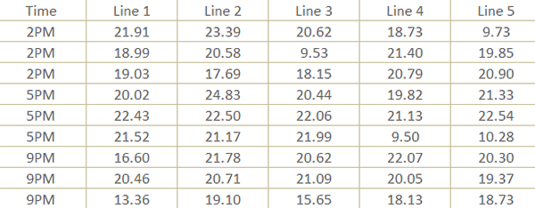
This makes perfect sense from the perspective of the engineer jotting things down during the study, but for analysis purposes, you want all of the observations in one column and another column to say which line each observation belongs to (just like with the Time column).
Now, you could fix this in Excel by either doing some copy-and-paste jockeying or trying to transpose the data. If the dataset is relatively small, this can be done pretty quickly, but for larger datasets, you’re probably looking at wasting time.
In R, you can do this in a couple relatively simple steps. In one simple step, actually, but we’ll also do more than just the bare minimum.
You can download the script here if you want to follow along.
Let’s start with loading the packages we’ll be using; the tidyverse and sherlock. The tidyverse is a collection of packages such as dplyr, readr, stringr, ggplot2, tidyr etc., each of which having its own set of functionality. Sometimes you’ll want to load just one of them, say dplyr, but a lot of times simply loading the tidyversewill do the trick.
We’ll then use sherlock’s load_file() function, as described last week, to read in the dataset from my GitHub repository. Make sure to change the filetype argument to “.csv” as this is a .csv file.
We’ll save the dataset into memory as bond_strength_wide (referring to the current wide format of the data)—we’ll transform it into the format we need in no time though!
# WEEK 003: A PIVOTAL MOMENT

# 0. LOADING PACKAGES ----
library(tidyverse)
library(sherlock)


# 1. READ IN DATA ----

bond_strength_wide <- load_file("https://raw.githubusercontent.com/gaboraszabo/datasets-for-sherlock/main/bond_strength_wide.csv",
                                filetype = ".csv")
Here are the steps:
- Use dplyr’s mutate() function to create a column called Cycle, then use base R’s rep() function to create the numbering sequence 1:3, then convert it into a factor variable.
- Use tidyr’s pivot_longer() function to convert the data frame into a long format.
- Use dplyr’s mutate() function to update the Line column. The update we are going to make is removing the string “Line “ from each observation to make
- Then use dplyr’s arrange() function to arrange by the columns Time and Line. This is not really necessary for plotting purposes but provides a way to verify that you did everything right.
# 2. DATA TRANSFORMATION ----

bond_strength_long <- bond_strength_wide %>%

    # 2.1 Create "Cycle" column ----
mutate(Cycle = rep(1:3, times = 3) %>% as_factor()) %>%

    # 2.2 Convert to long form ----
pivot_longer(cols = 2:6, names_to = "Line", values_to = "Bond_Strength") %>%

    # 2.3 Remove "Line" string ----
mutate(Line = Line %>% str_remove("Line ")) %>%

    # 2.4 Arrange by Time and Line variables (not absolutely necessary) ----
arrange(Time, Line)


bond_strength_long
Let’s run bond_strength_long by moving the cursor over it and hitting Ctrl + Enter.
# A tibble: 45 × 4
   Time  Cycle Line  Bond_Strength

<chr> <fct> <chr>         <dbl>

 1 2PM   1     1             21.9

 2 2PM   2     1             19.0

 3 2PM   3     1             19.0

 4 2PM   1     2             23.4

 5 2PM   2     2             20.6

 6 2PM   3     2             17.7

 7 2PM   1     3             20.6

 8 2PM   2     3              9.53

 9 2PM   3     3             18.2
10 2PM   1     4             18.7
# ℹ 35 more rows
# ℹ Use `print(n = ...)` to see more rows
It looks like everything checks out, and we are ready the plot the data.
As a first step, we are going to plot using a technique called stratification where the data are grouped and plotted by a specific variable. We do this to separate the data by that variable and ultimately to see what kind of differences exist between the groups.
We are going to unleash the power of ggplot2 to do this.
# 3. PLOT DATA ----

# 3.1 STRATIFICATION BY LINE ----
bond_strength_long %>%
    # calling the ggplot() function and creating a blank "canvas" (coordinate system)
    ggplot(aes(x = Line, y = Bond_Strength)) +
    # adding a geom (visual)
    geom_point(size = 3.5, color = "darkblue", alpha = 0.3) +
    # adding a custom theme
    theme_sherlock() +
    # customizing labels
    labs(title = "Bond Strength Characterization Study",
         y     = "Bond Strength [lbf]")
Let me briefly explain the above code.
First, we take the bond_strength_long dataset and pipe it (using %>%) into the ggplot() function and specify what we want plotted on the x and y axes. This time we want to plot Bond Strength on the y axis and the Line variable on the x axis. This essentially creates a blank “canvas” for the plot — nothing has been plotted just yet.
After that, we use the + operator to add different layers to the base canvas. First, we add the function for the type of visual we want to create, which in this case is a scatterplot type of plot (geom_point() function).
We then add a custom theme, which dictates the appearance of the plot. There are many out-of-the-box themes one can use, for example theme_minimal(), theme_bw() etc.; I tend to use the theme_sherlock() from the sherlock package for a minimalistic look.
And finally, to top things off, we add a title and a custom call-out for the y axis using the labs() function.
This is what the plot looks like:

Not too bad for a first try, right?
Now, we are going to further simplify what we just did by using a ready-made plotting function called draw_categorical_scatterplot(), which achieves the same thing while adding additional functionality.
# 3.2 STRATIFICATION BY LINE USING DRAW_CATEGORICAL_SCATTERPLOT() FUNCTION ----
bond_strength_long %>%
    draw_categorical_scatterplot(y_var = Bond_Strength, grouping_var_1 = Line, plot_means = TRUE, size = 3.5)
With this function you can also:
- Group (stratify) by up to three variables in a nested fashion
- Plot the means of each group or connect them with a line
- Set whether each group is displayed in a separate color
- Set the size and transparency of the data points
- Add jitter (a little bit of noise along the x axis) to deal with overplotting
To recap, in this week’s edition we went over how to do a basic data pivoting transformation and plotted the data both using basic ggplot2 functions and a built-in function called draw_categorical_scatterplot().
That’s it for this week—we will continue exploring this dataset next week.
Thanks for reading this newsletter! Reach out with any questions you may have.
Download this week’s script here.

Leave a Reply